Good Market: An Interaction Design Process

This a project that I completed through DesignLab. Good Market is a fictitious medium scale grocery franchise that wants a grocery shopping app to expand their market share.
mopfaScreen

Problem

Good Market believes that if they allow their customers to shop and buy their products online, they can expand their customer base and market share. They plan to design and release a pilot program in New York and San Francisco, iterate based on what they learn and then expand the product to other cities around the country.
Process

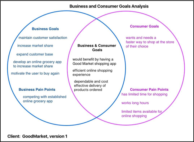
Business and Consumer Goals

For the goal analysis, I determined that the content was more important than the presentation. It was important to me to include just the most important goals for both the business and consumer.

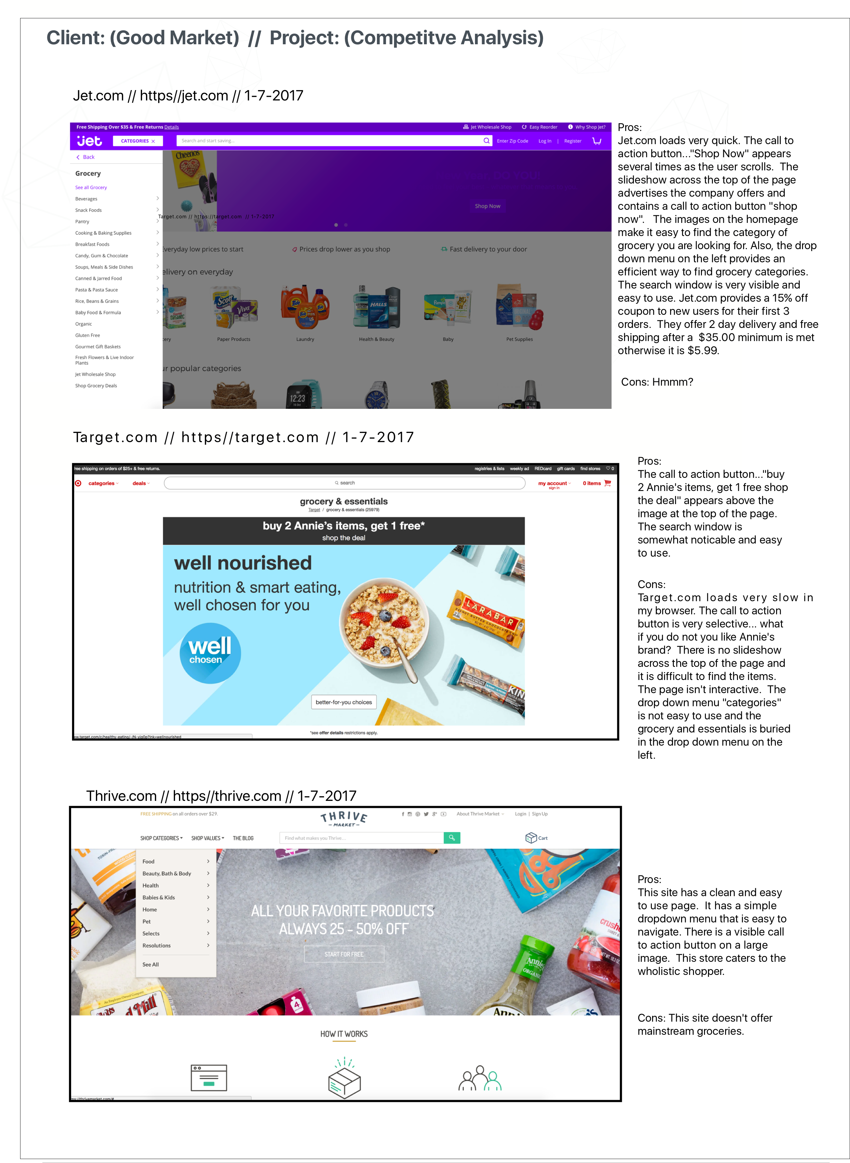
Competitive Analysis

Once the goals were laid out, I performed an analysis of Good Market's competitors. One feature that stood out among all the competitors was the iconography that Jet.com uses to help the user finds things faster. Also, it would be useful to further study the competencies of other successful smaller grocery apps. Finally, one thing that I would like to do next time is to detect which elements repeat in the pages and improve those specific elements.

Card Sort

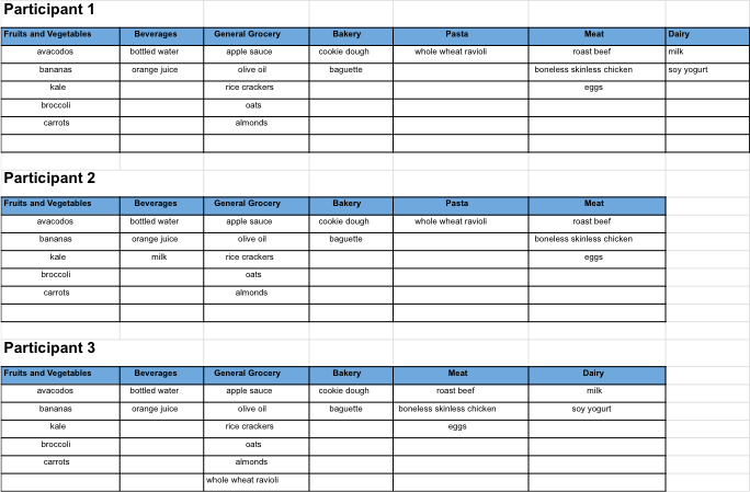
For this card sort, I identified 3 participants that were in the target market. The goal of this exercise was to see how the hypothetical users naturally categorize the items that will be on the site. I learned that card sorting isn't the answer to all of the problems that I was trying to solve, but it is a simple, quick and effective tool.

Good Market UI Requirements

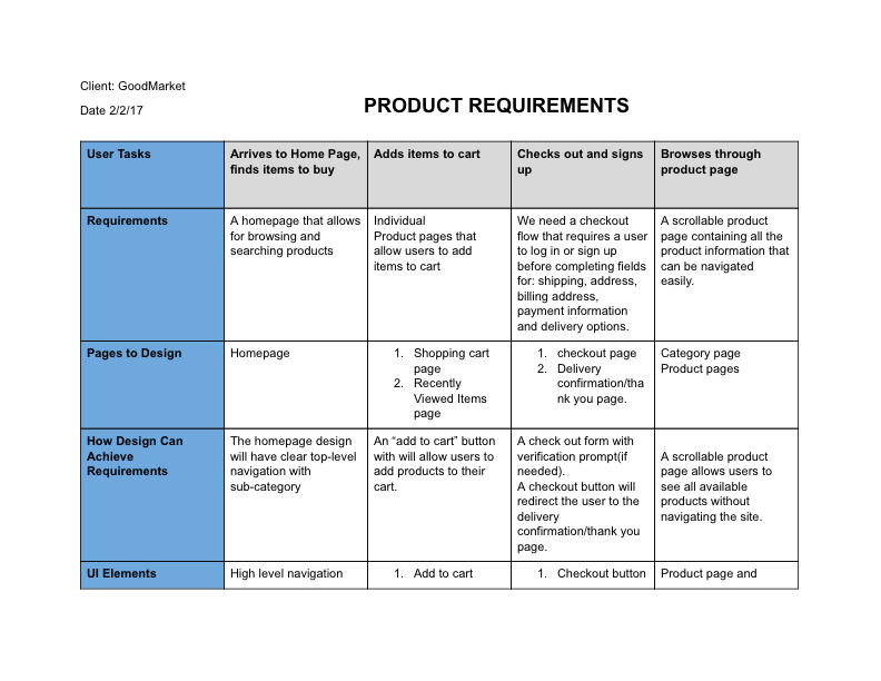
Before wireframing, the fictious Good Market product team put together a list of requirements for each task. I identified the features and other user interface elements that each page will need in order for the user to complete the flow. My takeaway from creating UI requirements is that it is easy to miss a step in the flow and to really use site analytics tools like mouseflow for the best user experience.

User Flow/Site Map

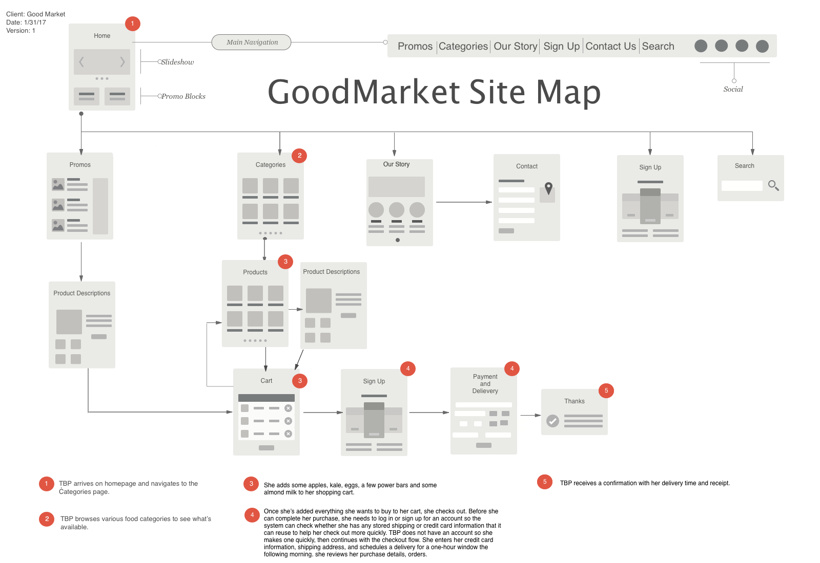
I decided to make a combination of both site map and user flow. Another option I considered is to track a separate user flow per action, and map the content as low fidelity. While completing the flow, I was starting to think about some options to have for the product description page like information, gallery, and a call to action button.

Conclusion

In this project I took a set of business requirements and user goals, and turned that into a set of core user flows, sitemaps, and wireframes — all keeping usability and heuristics in mind. If I were to proceed with this project, I'd move on to the Prototyping & Testing phase.

© 2017 Copyright Design by Tara Larsen

g